I’m pretty excited for today’s sharing. It’s something I’ve never done before, but I thought could be helpful for my friends or anyone out there who’s always looking for more affordable alternatives to amazing high end products. It all started when I was tidying up my vanity and looking through my eyeshadow palettes. I happened to pick up my beloved Modern Renaissance (Anastasia Beverly Hills) and comparing it with my Cocoa Blend (ZOEVA). And it just dawned on me how similar some of the shadows are. So I thought why not put both products to the test and see which performs better.
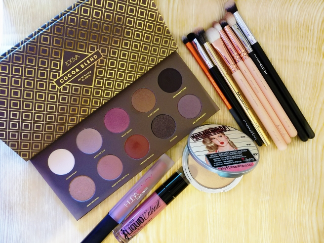
As with all my Judge Judy posts, here are details of the products we’re gonna test today:
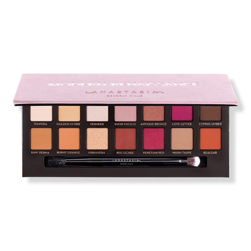
(Image source: http://www.ulta.com/modern-renaissance-eyeshadow-palette?productId=xlsImpprod14291015)
Anastasia Beverly Hills (ABH) Modern Renaissance Eyeshadow Palette:
- 42.00 USD for 0.28 oz
- An essential eyeshadow collection with 14 shades in neutral to berry tones
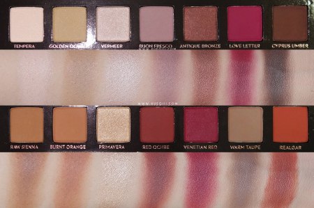
(Image source: http://www.xueqiii.com/2016/07/anastasia-modern-renaissance-palette.html)
Eyeshadows put to the test: Tempera, Burnt Orange, Red Ochre, Venetian Red, Love Letter, Vermeer

(Image source: https://www.zoevacosmetics.com/europe1/eyes/eye-palettes/70/cocoa-blend-eyeshadow-palette)
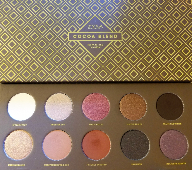
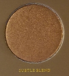
ZOEVA Cocoa Blend Eyeshadow Palette:
- 26.50 USD for 0.50 oz
- Features 10 eyeshadows in various warm-toned hues ranging from beige to plum to copper
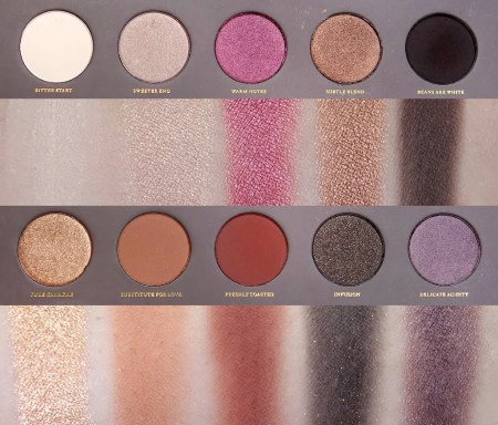
(Image source: http://www.xueqiii.com/2015/12/zoeva-cocoa-blend-palette-review-and.html)
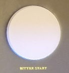
Eyeshadows put to the test: Bitter Start, Substitute for Love, Freshly Toasted, Warm Notes, Sweeter End
So as you have seen above, ZOEVA’s Cocoa Blend is relatively more affordable than ABH’s Modern Renaissance. Granted Modern Renaissance has 14 shades while Cocoa Blend has 10. However, the net weight of the former is only slightly more than half of the latter which means you get way more product with Zoeva than with ABH. While both are categorized as warm-toned palettes, there are some differences between them. Aside from the colors that I have chosen to put to the test, the other shades in both palettes are pretty dissimilar, with Modern Renaissance having orange, mauve and brown shades while Cocoa Blend adding bronze, purple and black shades. I think it’s great that these differences exist as that allows more options for consumers when deciding to purchase warm neutral eyeshadow palettes.
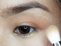
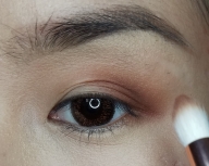
Now, let’s focus on the ten or so colors that I will be putting to the test. FYI, I used the same eyeshadow primer on both my eyes and also used the same brushes to apply the eyeshadows. I also made sure to clean the brush with dry tissue prior to dipping into new colors to prevent any transfer.
| ABH Modern Renaissance | ZOEVA Cocoa Blend | |
| Shade | Tempera | Bitter Start |
| Description | light beige with warm, peachy tones and a satiny sheen | light beige with subtle, warm undertones and a semi-matte finish |
| Application & Performance | feels silky soft, good color payoff | a bit more powdery, not as opaque as Tempera |
| ABH Modern Renaissance | ZOEVA Cocoa Blend | |
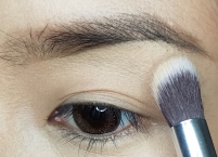
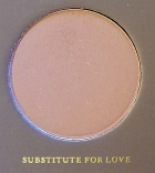
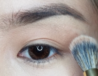
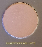
| Shade | Burnt Orange | Substitute for Love |
| Description | medium orange-brown with warm undertones and a matte finish | medium-dark, orange-brown with a mostly matte finish |
| Application & Performance | more kickback in pan but more pigmented than Substitute for Love | zero kickback, same blendability as Burnt Orange |
| ABH Modern Renaissance | ZOEVA Cocoa Blend | |
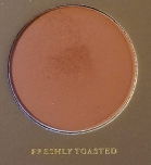
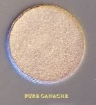
| Shade | Red Ochre | Freshly Toasted |
| Description | medium-dark reddish-brown with warm undertones and a matte finish | medium-dark reddish brown with warm, orange-red undertones and a matte finish |
| Application & Performance | slightly more kickback in pan, more pigmented and much easier to blend than Freshly Toasted | color is not fully even, there seems to be a brown undertone that tends to grab on to crease and cause a bit of patchiness |
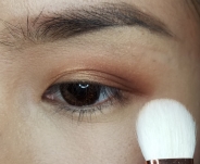
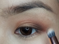
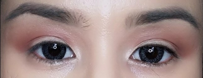
This is how the colors thus far look on my eyes. If you observe closely, you will notice that the crease color looks a tinge better on the ABH side than the ZOEVA side. Otherwise, the rest of the shadows look very similar despite the little disparities reported above.
|
ABH Modern Renaissance |
ZOEVA Cocoa Blend |
| Tempera (set primer)
Burnt Orange (transition) Red Ochre (Crease) |
Bitter End (set primer)
Substitute for Love (transition) Freshly Toasted (Crease) |
| ABH Modern Renaissance | ZOEVA Cocoa Blend | |
| Shade | Venetian Red + Love Letter | Warm Notes |
| Description | medium-dark red with subtle, warmer undertones and a mostly matte finish
+ dark berry with subtle, cool undertones and a mostly matte finish |
rich, brightened cranberry red with warm, copper brown undertones and a metallic finish |
| Application & Performance | more kickback but more pigmented than Warm Notes, obviously not shimmery because these are matte colors but the berry color payoff is much more impressive for these than Warm Notes. | beautiful shimmer finish but the berry tone is not as rich and deep as Venetian Red and Love Letter. |
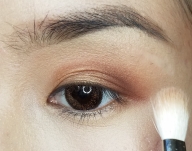
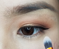
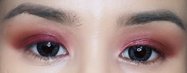
This is how the lid color performs. I had to mix two shades from the ABH palette (a red and a berry) to come close to the Zoeva shade (a berry red). Clearly the ZOEVA side looks shimmery while the ABH side appears mostly matte since those are their respective finishes. In this case I would say each deserves its own credit.
|
ABH Modern Renaissance |
ZOEVA Cocoa Blend |
| Venetian Red + Love Letter (lid) | Warm Notes (lid) |
| ABH Modern Renaissance | ZOEVA Cocoa Blend | |
| Shade | Vermeer | Sweeter End |
| Description | bright, light peach with warm undertones and a frosted sheen | heavily gold-shimmered peach with a hint of pink |
| Application & Performance | a brighter shade with more shimmer than Sweeter End | deeper toned due to the gold hues, not as impressive as an inner corner highlight as Vermeer |
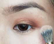
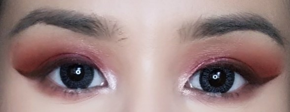
This is the final look with the above two colors placed as inner corner highlights. As mentioned, the ZOEVA shade looks less bright due to its deeper gold undertone while the ABH side is blinding all right, making it a more ideal option for a popping tear duct highlight.
|
ABH Modern Renaissance |
ZOEVA Cocoa Blend |
| Vermeer (inner corner highlight) | Sweeter End (inner corner highlight) |
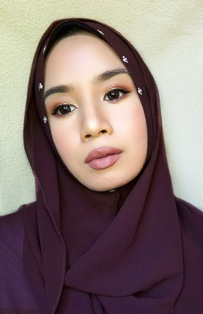
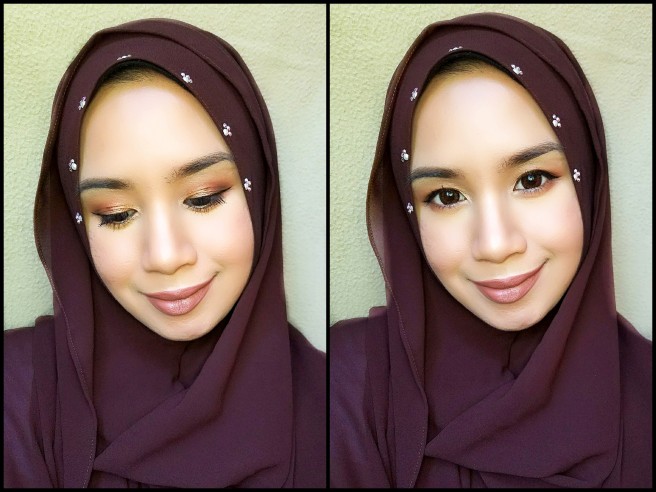
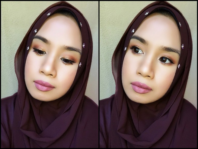
After touching up a bit to make them look pretty similar, this is how the eyeshadows fit in a completed makeup look:
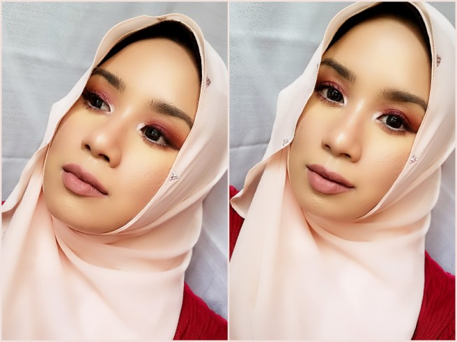
Here I wanted to go for a softer and almost monochromatic pinkish look, so I went in with the shade Matte Naked, a medium beige pink nude from my Milani Color Statement Moisture Matte Lipstick.
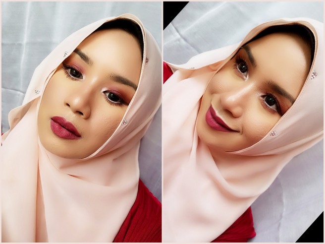
Alternatively, a berry toned lip color is also very suitable with this eye makeup. For this, I only used a lip liner in the shade Cherry Skies, a deep berry from NYX Suede Matte Lip Liner to line my lips and fill them in.
So what’s my verdict on the two eyeshadow palettes? I’d say that in terms of quality, I am impressed with both. My 7-hour wear test indicates the same level of longevity for both eyeshadows (both lasted the entire wear test without fading or smudging). I personally lean more towards the ABH Modern Renaissance palette because of the edge it has over the ZOEVA Cocoa Blend in terms of blendability, pigmentation and color range. However, if you are under a budget and unwilling to fork out anything more than 30 bucks on an eyeshadow palette then you will not regret going for the latter.
I’ll leave you with my final breakdown on these two palettes. I hope you found this post useful. Till the next one!
|
ABH Modern Renaissance |
ZOEVA Cocoa Blend |
HIGHLY RECOMMENDED |
HIGHLY RECOMMENDED |